# Seven visual tools, one diagram
I write more than I draw, and the drawing is always the part of a post that takes longest. A thousand words land in an evening. One architecture diagram I'm happy with can eat a whole afternoon. Excalidraw is fast, and it's good, but if you've published with Excalidraw for any length of time you start to notice that everything you make in it looks like everything else made in it. The hand-drawn aesthetic stops being a personality and turns into a tell.
What I actually want is a visual that has some attitude. The kind of diagram people screenshot and put in slides. Something a reader pauses on for a beat before scrolling into the prose. Most of my posts are about infrastructure, so the visuals tend to be architecture-y, but the bar I'm chasing is closer to a magazine illustration than to a whiteboard photo.
A few months ago Claude Code started shipping a marketplace of plugins and skills, and several of them claim to draw exactly this kind of thing. I'd been meaning to test them and kept putting it off. So I sat down one weekend, picked a representative diagram, and ran the same brief through every tool I could find. Then I evaluated them side by side and kept the ones I'd actually reach for.
This is what I learned.
The diagram I picked
The test case was a fairly busy multi-region Kubernetes setup. Three EKS clusters in three regions, with one of them acting as an ArgoCD hub doing App-of-Apps sync to the other two. Karpenter handling compute on each cluster, KEDA scaling one specific workload, and a unified observability stack feeding into a single account that pages out to an on-call rotation.
It's not a toy. There's enough going on that a half-baked tool would visibly fall apart, and enough structure that a well-designed tool would have something to organize.
The lineup
| # | Tool | What it is |
|---|---|---|
| 1 | Cocoon-AI/architecture-diagram-generator | A claude.ai web skill |
| 2 | cathrynlavery/diagram-design | A Claude Code plugin built around a design system |
| 3 | edlebertf/claude-infographic-gif | A Claude Code skill for animated GIF infographics |
| 4 | claudekit/frontend-design-pro-demo | A Claude Code plugin for frontend interfaces |
| 5 | Vercel ai-cli + bfl/flux-2-pro | An image-gen CLI talking to Vercel's AI Gateway |
| 6 | A hand-coded SVG | The control |
| 7 | Excalidraw | The thing I was trying to graduate from |
Installing them was less smooth than I expected. The shell command I tried first, claude plugin add <repo>, doesn't exist. Claude Code's plugin system runs inside the TUI via /plugin marketplace add and /plugin install, or you git clone raw skills into ~/.claude/skills/<name>/. The Cocoon entry on that list isn't a Claude Code plugin at all; it's a claude.ai web skill that you upload as a zip in the browser. I gave up on installing it from the CLI and drew its equivalent by hand instead, which means my Trial 1 below is more "Claude doing AWS re:Invent" than "the Cocoon skill doing what it does". For an apples-to-apples Trial 1 you'd have to upload the actual zip at claude.ai.
Trial 1 — the AWS re:Invent stand-in
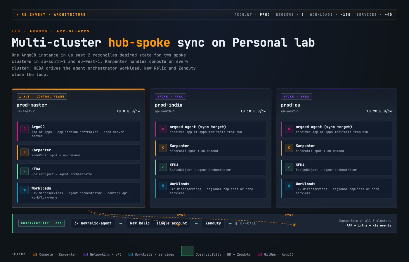
I went with the AWS re:Invent aesthetic because anyone who's watched a cloud keynote in the last ten years will recognize it instantly. Three cluster cards in a row, each with the full service stack listed inside (ArgoCD, Karpenter, KEDA, workloads), category-coded by AWS's own palette (orange for compute, purple for networking, green for observability, pink for GitOps), and an observability strip at the bottom tying agents to the on-call system.
The output is dense. It's the kind of thing I'd use as an inline reference figure in a long post where the prose already explains each piece. If I dropped it as a hero, it'd be too much.
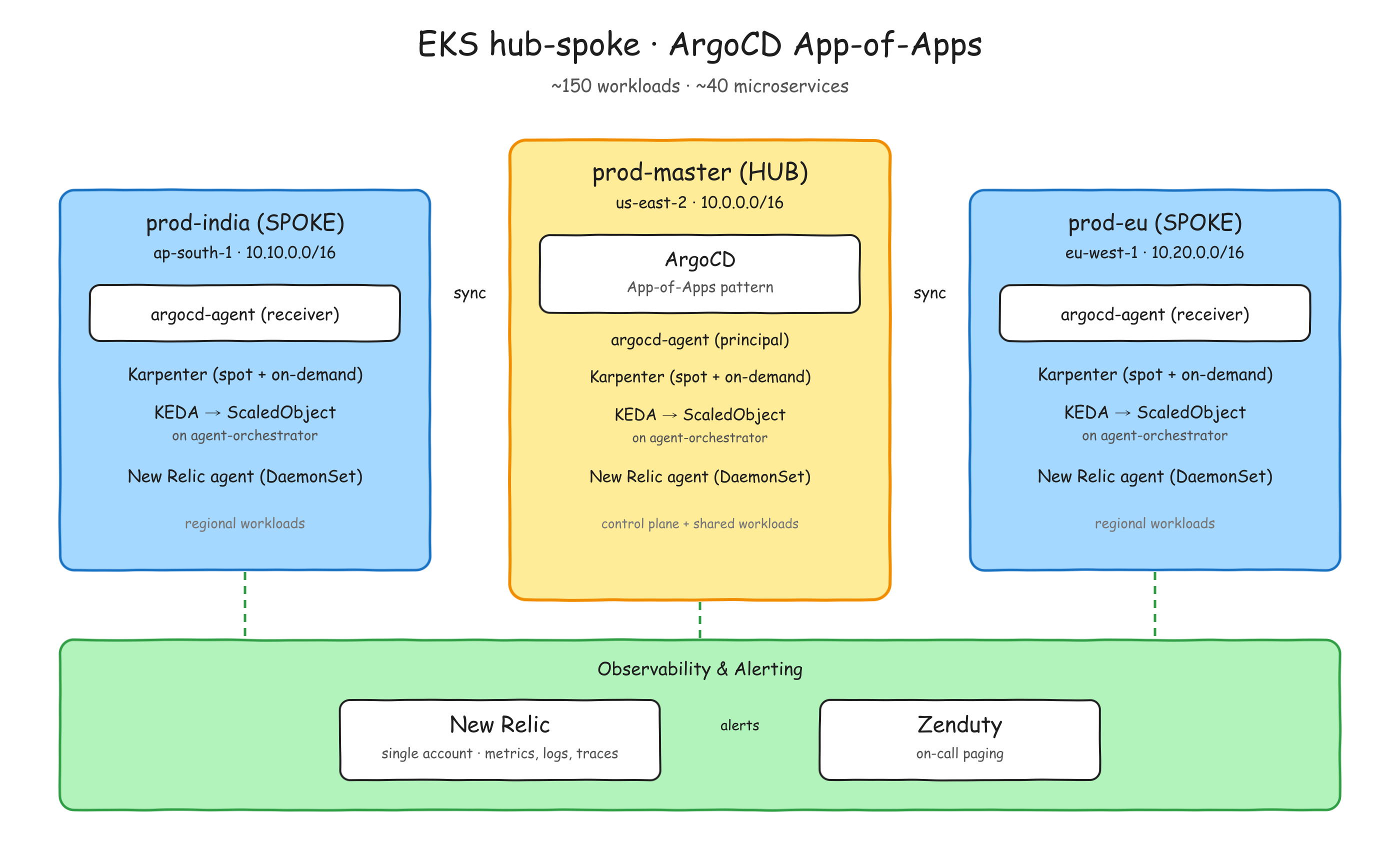
Trial 2 — diagram-design
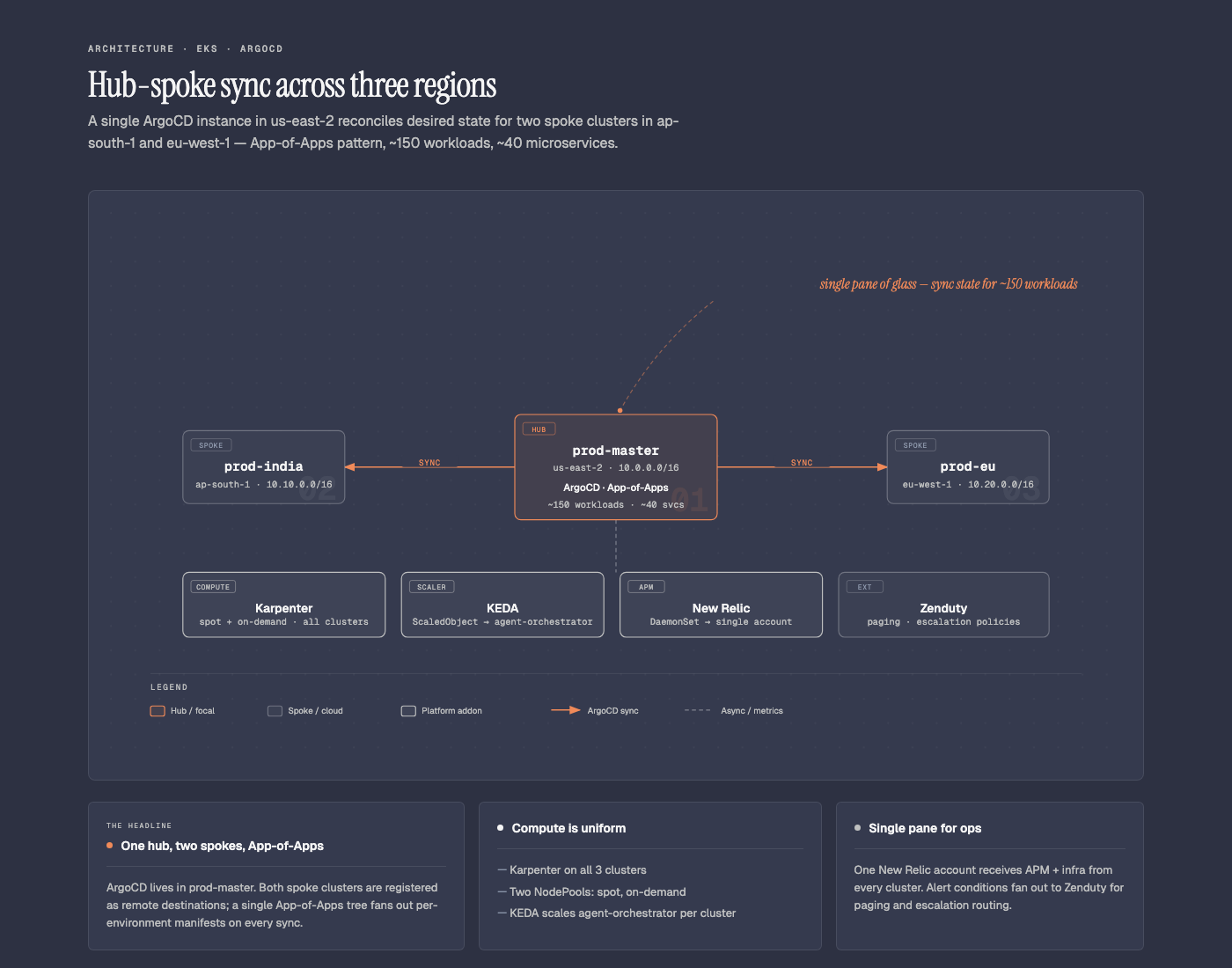
This is the one I'd actually publish without retouching. The skill has a real design system baked in: one focal node in coral (and only one), two muted spokes, italic-serif annotation off to the side, summary cards underneath with varied widths, hairline borders, no shadows anywhere. The skill's own instructions are pretty firm about it, even setting a target density of 4 out of 10 and telling itself to delete anything that doesn't earn its place. You can feel that restraint in the result.
It looks like it came out of someone who's spent a long time thinking about diagrams as a form, not from a tool that randomly throws boxes on a page.
Trial 3 — infographic-gif
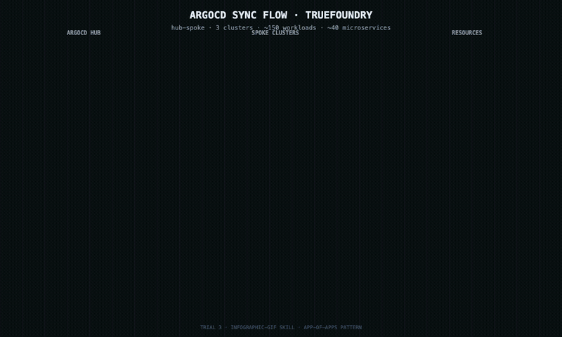
This one surprised me. The output it gives you is an HTML file, not a GIF. You open the HTML in a browser, it canvas-renders frames for a few seconds, and then a "Download GIF" button appears. So the actual deliverable is two clicks away from what the skill spits out. Once you watch it animating though, it's properly satisfying. Mine became a three-stage sankey: hub on the left, three clusters in the middle, three aggregated resource buckets on the right, with bezier curves drawing in left to right.
One thing to know if you try this: the skill's sankey template is fundamentally two-level. Sources on the left, destinations on the right, with one center node. I had three layers, so the per-cluster resource breakdown got merged into single resource totals. The proportions are honest, the per-cluster detail isn't quite there. For an animated explainer where motion is the point, that's an acceptable trade.
Trial 4 — frontend-design-pro
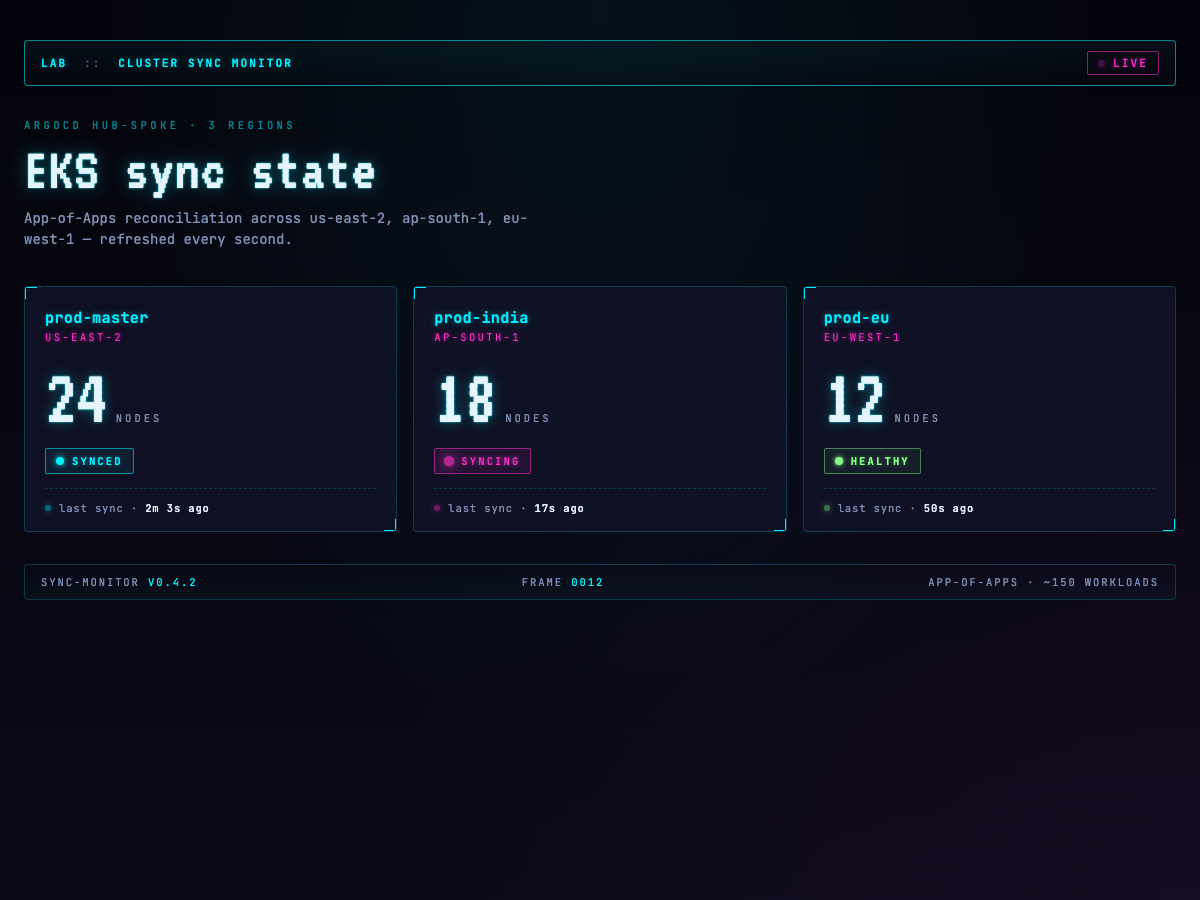
I asked for a "live cluster status panel" in a cyberpunk aesthetic and got exactly that. CRT scanlines, VT323 for the chunky CRT-display digits on the node counts, neon accents, a magenta pulse on the panel that's marked syncing. A tiny script ticks the relative timestamps every second so the thing feels alive.
In isolation it looks great. Embedded in a sober technical post though, it would scream at the reader and you'd basically end up designing the rest of the post around the widget. So I went back to the same skill with a tighter brief to see if it could play in a calmer register.
Same skill, second pass
I asked it to draw the request lifecycle through an Istio ingress. Seven hops, client through NLB through gateway and onwards to a pod, with a return path back. Two deliverables: an animated HTML diagram, and a Flux image prompt for the static raster version.
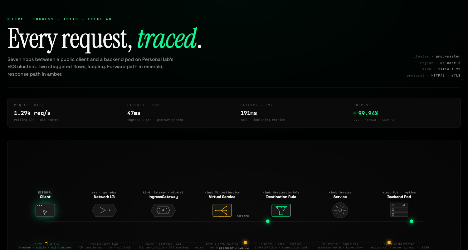
First attempt came back as a dashboard again. Big hero title, live telemetry chrome on top (latency, request rate, success percentage), seven custom component glyphs in a row, emerald packets going forward and amber packets coming back along a parallel return wire. It's a beautiful page, but it's still very much a page. If I tried to inline this inside another post, it would take over.
So I asked again. Same skill, third pass, this time framed as "a figure for the body of a blog post, not a dashboard":
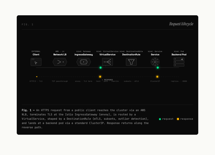
This is the version that goes inside a post. 760px wide, a real <figure> with Fig. 1, the diagram, and a real <figcaption> mixing a sentence of prose context with an inline legend. Self-contained dark so it doesn't fight whatever theme surrounds it. The skill gets to the right answer once you tell it the right question.
And the Flux raster, prompt written by the skill, rendered by ai-cli:

Eighteen seconds of generation, zero human prompt-engineering on top. The skill's prompt was the work.
Trial 5 — Vercel ai-cli + Flux

This is the one I'd use as a section header or a post cover. Flux 2 Pro through Vercel's AI Gateway, twelve seconds to render, a single one-line prompt. It's not replacing a technical figure (you can't actually point at anything in it), but as visual atmosphere at the top of a post, it carries weight. One thing to watch: the model ignored my --size 1200x630 flag and inferred an aspect ratio instead. The CLI surfaced a warning about it, which I only noticed by accident. Check your output dimensions before you cut it into a layout.
Trial 6 — Hand-coded SVG

The baseline. AWS-orange-on-navy, three boxes in a row, dashed hub-spoke arrows, observability strip at the bottom, color-coded legend. 12 KB, no JS, no fonts, no dependencies. Loads instantly, scales infinitely, and is trivial to edit when the architecture inevitably changes. Inside a long post where you need a quick reference and you don't want to fight CSS, this is more than enough. It's also the least visually interesting of anything in the lineup, which is either a feature or a bug depending on what the post is doing.
Trial 7 — Excalidraw (via the official connector)
[Download the .excalidraw source →](/images/six-visual-tools-one-diagram/trial-7-excalidraw.excalidraw) · View as SVG →
Excalidraw is what I'd been using before this whole exercise, and it's the thing I was originally trying to graduate from. There's an official Excalidraw connector in the Claude.ai directory, so I dropped the same brief into it. It took the connector about four minutes to produce this.
The surprising thing isn't the layout — it's the aesthetic. The connector deliberately chose not to look like Excalidraw. The strokes are clean and straight, no rough.js wobble. The typography is sans-serif, not the Virgil hand-drawn default. Everything is grid-aligned, with nested sub-components: argocd-agent (receiver) boxes inside each spoke, an argocd-agent (principal) callout inside the hub, separate New Relic and Zenduty boxes inside the observability strip, an alerts flow connecting them. It reads as "architecture diagram drawn in Excalidraw" rather than "Excalidraw scratchwork".
That changes my read of Trial 7 in a way I didn't expect. The connector quietly opted out of the genre I'd complained about in the opening of this post. The casual hand-drawn aesthetic is one register of Excalidraw now, not the default Excalidraw. The canvas can be a sketchpad or a structured diagram tool, depending on how the scene is authored. The connector chose the structured side.
For the kind of visual I'd actually publish, the polished register it picked is closer to what I'd ship than the wobbly default would have been. If you specifically want the wobble, you'd have to ask for it.
(Small caveat on the rendering: the PNG above is exported from an SVG approximation, not from Excalidraw's own engine, so the strokes and font are close-but-not-identical to a canonical Excalidraw export. Open the .excalidraw source in Excalidraw and use File → Export → PNG (2×) for the official render. The difference is subtle.)
What I'd reach for, in practice
For inline figures inside a long-form technical post, diagram-design won by a wide margin. The design system has real taste in it, the output looks publication-quality without me retouching anything, and the constraints (one focal node, no shadows, hairlines) keep the diagrams from feeling busy. This is the one I'll be using most.
For animated explainers, infographic-gif is decent when the motion actually adds information. The HTML-not-GIF artifact is mildly annoying but not a dealbreaker. If you need animated HTML where you control the design tightly, frontend-design-pro is more flexible, but you have to brief it carefully. Ask for a "live cluster panel" and you'll get a dashboard. Ask for "a figure to embed in the body of a blog post" and you'll get a figure. The skill responds to scope cues.
For hero images or section openers where the goal is mood rather than information, Flux through ai-cli is hard to beat at twelve seconds and one prompt. The cost per image is low enough that you can iterate a few times until something lands.
For quick reference diagrams inside a post, hand-coded SVG is still where I end up. It costs nothing to maintain, ages well, and gets out of the reader's way. Not every diagram needs to be a hero.
For the first draft, Excalidraw the app — still the fastest way to figure out where the boxes go in five minutes. For a ready-to-ship version with the Excalidraw canvas behind it but without the genre aesthetic, the Claude connector turned out to be a genuine option I hadn't expected to like.
Keeping all of this from eating your context
One thing I noticed after installing six different visual-generation plugins: every skill they register goes into the Claude Code system prompt at session start. Whether you use them or not, they're paying rent in your context window. Six skills isn't a lot in absolute terms, but if you add up everything else you've installed (MCP servers, hook configs, agent definitions), sessions start to feel heavier than they used to.
There are a few commands that aren't well-advertised but are exactly what you want:
claude plugin list             # what's installed, at which scope, enabled or disabled
claude plugin details <name>   # the actual skills, hooks, MCP servers this plugin loads
                               # plus its projected token cost
claude plugin disable <name>   # turn it off
claude plugin enable  <name>   # bring it back
claude plugin disable -a       # disable everything (start fresh)
The one I'd specifically call out is details. It tells you exactly what a plugin pulls into your session, and the rough token cost of having it loaded. If you feel like your context budget vanishes before you've done much, this is where to look first.
There is one wrinkle: enable and disable don't take effect mid-session. The skill set is fixed when Claude Code starts up, so toggling a plugin only changes the next session. In practice this turned into a workflow change for me. I keep most of these visual-generation plugins disabled by default at the user scope, install them at the project scope of my blog repo, and let them auto-activate when I cd into the blog. Outside of the blog, the context stays lean.
The setup is two commands per plugin:
# globally disabled
claude plugin disable -s user diagram-design
claude plugin disable -s user frontend-design-pro

# from inside the blog repo
claude plugin install -s project diagram-design@diagram-design
claude plugin install -s project frontend-design-pro@frontend-design-pro
After that, only sessions started inside the blog directory see those skills. Everywhere else, they're not loaded, not adding to the prompt, not costing me tokens. When I want them back globally I can enable them again.
What I'm using now
Three tools and a fallback. diagram-design for any inline schematic. frontend-design-pro, in its blog-trimmed form, for animated or live-feeling diagrams once I've told it to behave like a figure. Flux through ai-cli for cover images and section openers. Hand-coded SVG when I just need a fast reference and don't want to think about it. The evaluation took most of a day. The diagrams take a few minutes each from here.
If you're considering doing something similar, the meta-lesson I'd offer is to pick one test diagram that's representative of what you'll actually publish, and then run every candidate against the same brief. The differences between these tools are not subtle, but they're not obvious from the marketing either. You see them when the same input comes out in six different ways.